Optimizing First Impressions with STARZ
User Centered Desgin | Competitive Analysis | Usability Testing
The Challenge
Optimizing First Impressions
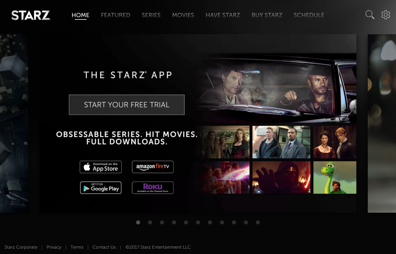
Although the STARZ app made close to 100 million in revenue in 2017, many of its users purchase through 3rd party stores like the Apple store or the Roku store. To maximize revenue, STARZ needed to increase the number of users purchasing directly through their website (www.starz.com).
My Role
UX Research & Design
As a UX designer at STARZ, it was my responsibility to analyze pain points in the conversion process and identify solutions to improve direct billing conversions.
The Process
At A Glance
Checking Our Assumptions
Rather than rely on my own suspicions and preferences about the onboarding process, I used heuristic analyses and rapid user surveys to identify pain points in the conversion process. The user surveys I conducted through Usability Hub were particularly helpful because they helped put a compelling, human face on the issues. These users were asked to view the home page and answer the questions: Would you purchase a subscription to STARZ? If no, what is stopping you from choosing STARZ? Users who were not interested in STARZ reported that:
- “It is not clear what the films are”
- “I need to know what exclusive shows are being offered.”
- “I need more information to decide, it is very little information”
- “What is the price after the free offer?”
- “I trust Netflix. There would need to be a reason, like a better price, for me to switch”
Targeted UX Tactics
Once I had a clear understanding of the challenges users faced moving through the conversion process I identified proven tactics for mitigating these issues (and increase the number of conversions). These tactics are:
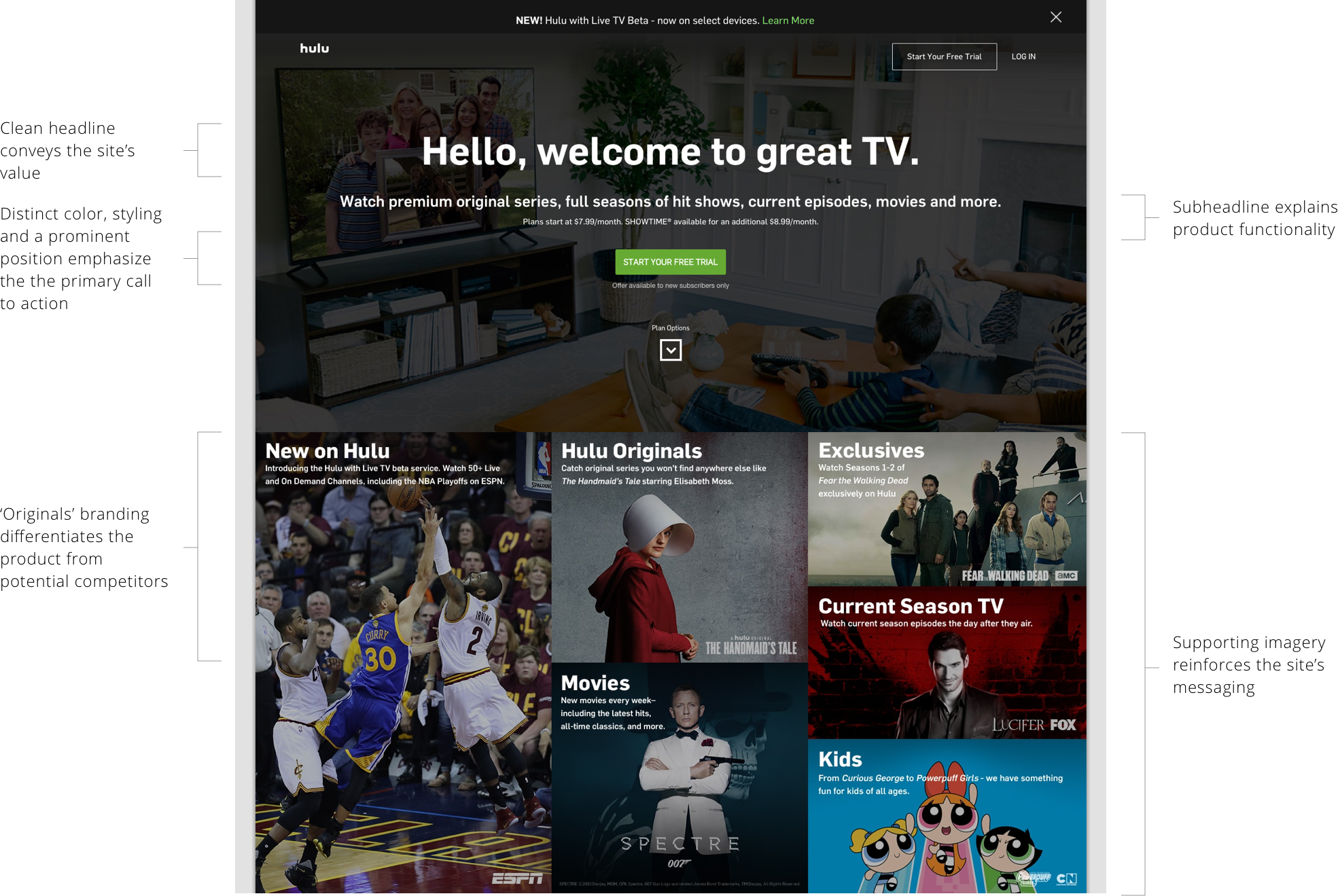
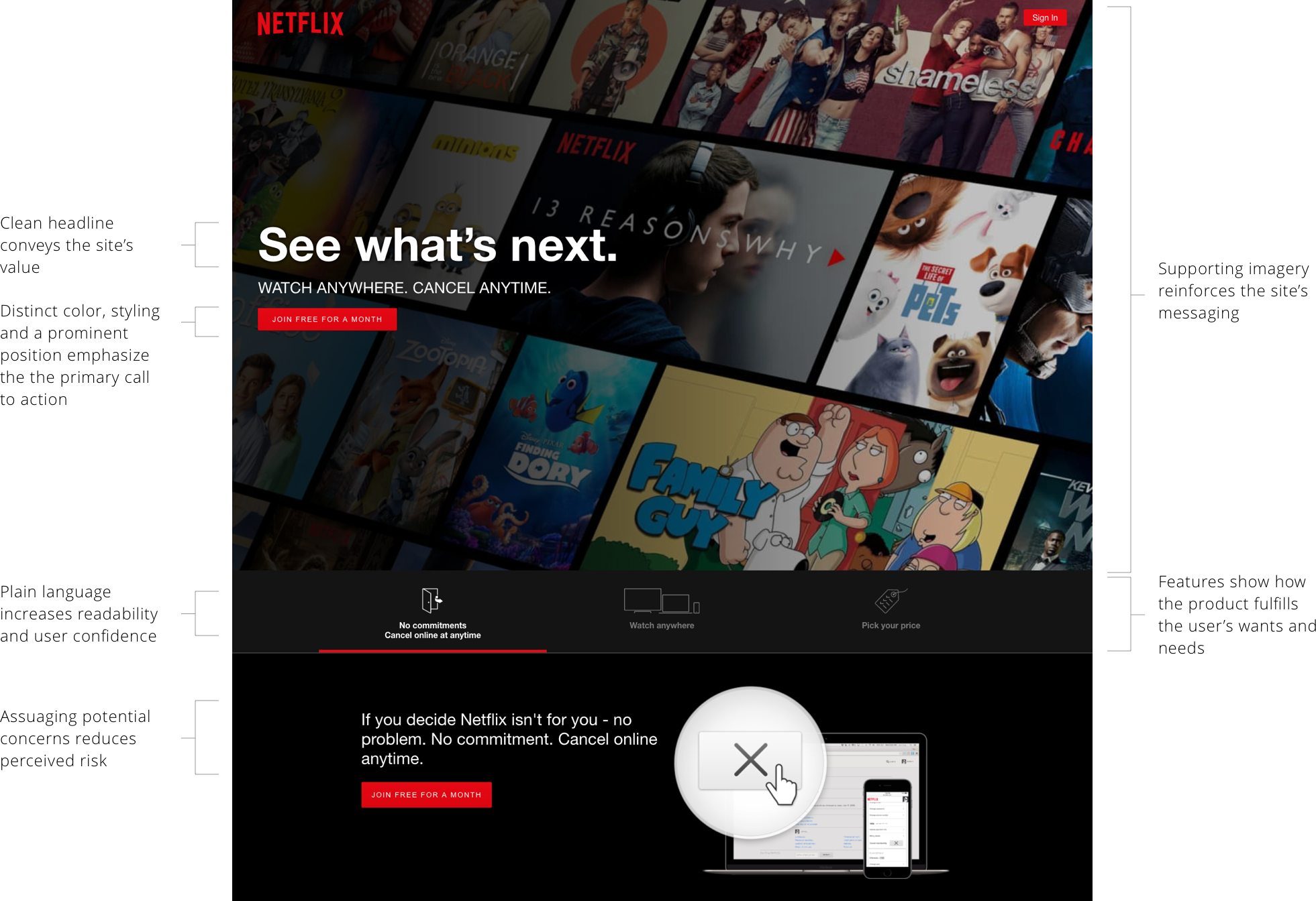
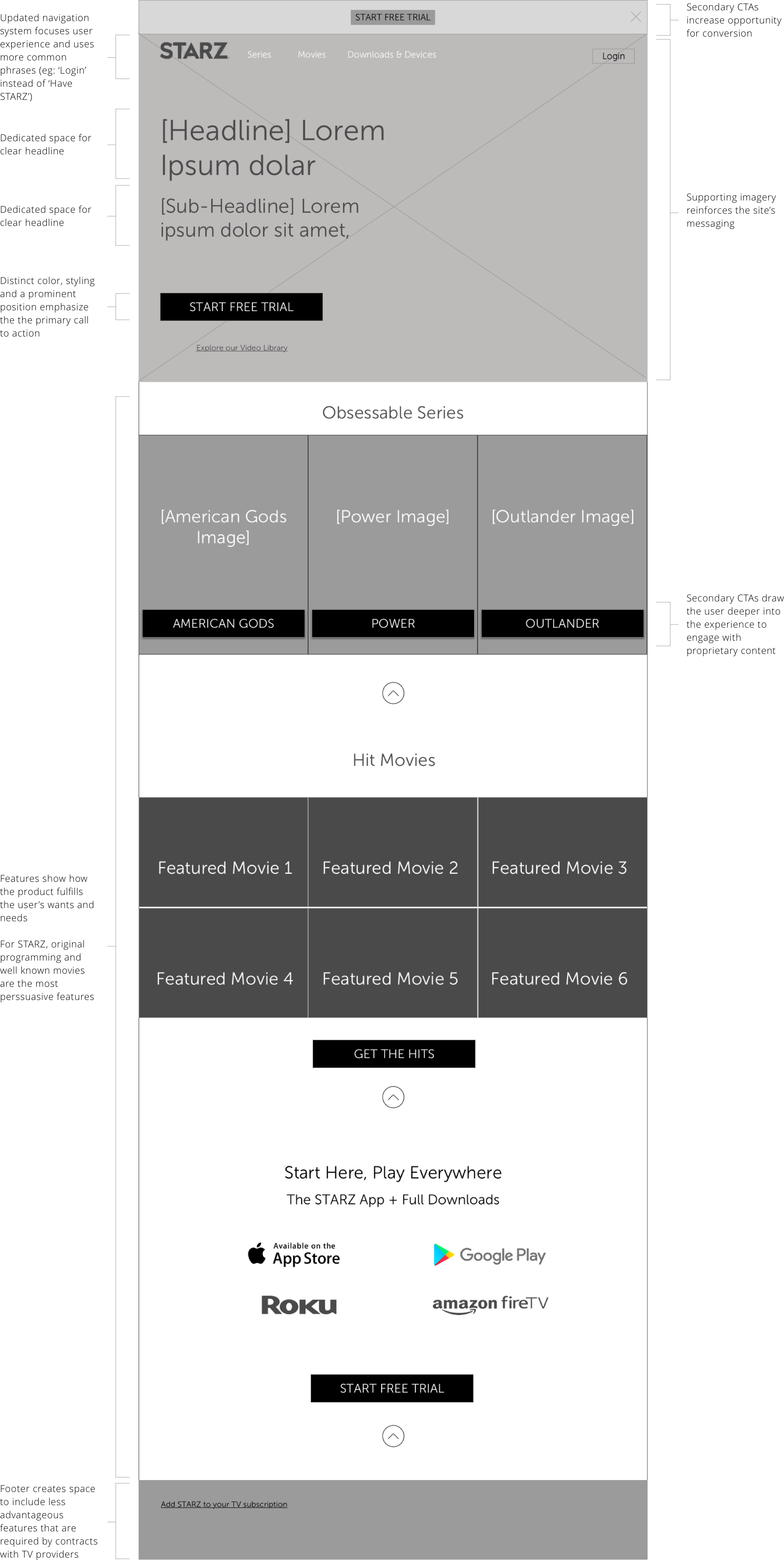
- Emphasize calls to action with styling, color, positioning, and visibility
- Demonstrate value/benefits for users through:
- Headline (Conveys site value)
- Sub-headlines (Explains product functionality)
- Branding STARZ original offerings (Differentiates product)
- Features (Demonstrates how product satisfies user needs)
- Supporting imagery (Reinforces supporting details)
- Reduce perceived risks by:
- Assuaging potential concerns
- Using plain language to explain billing, terms of use, etc.
- Set clear expectations
- Give users specific, relevant details at each stage of the journey
- Reinforce calming messages
Analyzing Best-In-Class Competitors
With these tactics in mind, I conducted a competitive analysis and collected examples to demonstrate how our competitors were already using these tactics to drive their own processes.

Making Improvements Without Reinventing The Wheel
Next, I created a series of wireframes to show how these tactics could be applied to the STARZ product. Although these wireframes were deeply reflective of industry standards, they were a significant change from the previous direction of the company. These wireframes were used to elicit feedback and buy-in from the director of the UX team before moving on to the details and branding that would give the designs more personality.
Bringing Wireframes To Life
Once we established a general consensus around the value of these tactics and an appreciation for how they could be applied to increase conversion, I worked extensively with one of our UI designers (Ryan McCarthy) to bring the page to life. Using the wireframes I provided, we were able to quickly create a high fidelity mockup for a second round of usability testing.
Validating Changes
In the second round of testing, our updated homepage was preferred by 80% of users. When asked to compare the original home page with our redesigned version, users described the new version as:
- “More complete, it provides more information”
- “Has a good layout, everything visible so as a user am aware of what am clicking on”
- “Feels more structured,... the other is overwhelming.”
- “It gives a better overview”
Although our early designs were preferred in user tests, we did find it challenging to sufficiently differentiate our design from our competitors (many of whom use black backgrounds and red buttons). To solve this problem, we drew more heavily from our brand book and TV-based marketing until we were satisfied our design would uniquely demonstrate our value and persuasively motivate users to convert into paying subscribers.
The Results
A Lasting Impact
Unfortunately, I had left STARZ by the time these changes were implemented, so I have limited information about the quantifiable impact of my designs. However, I am encouraged that since these changes were introduced in mid-2018, they have stood the test of time. At the time of this update (Jan 2021), the STARZ homepage still adheres to the framework I laid out in the work above. Considering the vital role this home page and onboarding experience play at STARZ, I am confident inferring that the changes made a verifiable improvement.